We’ve all been there: looking at a letter, formal document, or poster with Arial staring back at us. Don’t get me wrong, Arial is a great font, it’s tried and true, and gets the job done. But at the end of the day, sometimes we’re looking for more than “getting the job done”, and that’s when our Alternatives to Arial come into play. Another awesome aspect to these fonts? They’re all Google Fonts, which means they’re easier to use on websites, free to download, and easily available from the Google Fonts site. So, without further adieu, 4 Font Alternatives to Arial To Spice Your Documents Up:
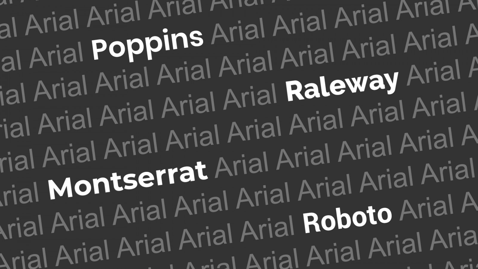
- Poppins
A stunning geometric sans-serif font that combines functionality with a touch of curvy fun. The Poppins family includes five weights ranging from Light to Bold and also includes the alternatives required for Latin language elements like é, à, and ç and so on. Originally published by The Indian Type Foundry in 2014 and constantly growing in usage, this is a great alternative to Arial.
- Raleway
Raleway might look familiar as it’s one of the font families used throughout the cHaus branding and website. Once again, combining a functionality with an element of fun, Raleway is perfect for businesses that are modern but don’t take themselves too seriously. Initially designed to only include a light weight, the font was expanded to include 9 other weights. Some of the interesting elements of Raleway include it’s approach to numbers. While most fonts keep numbers in line with text, Raleway drops some numbers below the descender line (see Anatomy of a Character here). This unique element can be both a positive and a negative, depending on who you ask, but don’t fret, as there are more traditional number characters available as alternatives included in the font.
- Montserrat
Increasingly growing as one of my favourite fonts to use, Montserrat has an understated coolness to it that combines strong Caps letters with a retro vibe. According to typeface creator Julieta Ulanovsky, the font was inspired by the old posters and signs of the Montserrat neighbourhood of Buenos Aires and brings back some of the type-styles of the early part of the 20th century. If that isn’t a cool enough reason to download this font, maybe the fact that it is available in 9 different weights AND has an alternative version with rounded elements to it.
- Roboto
Probably the most “Arialish” of the list, Roboto has all the elements that make a typeface great. It’s versatile, it’s professional when it needs to be, and it’s easy to read. The one noticeable difference to Arial is that Roboto has a more condensed look to it. This can be handy when you have a lot of content, but not a lot of space. Roboto is the only font on this list actually developed by Google and was actually created as the system font for the Android operating system. Google has described the font as “modern, yet approachable” and “emotional”. While it can be tricky to feel emotion when looking at a font, give it a try. Another fun fact about this font is that it is currently used on the B Division line of the New York City Subway.
And there you have it, four font alternatives to Arial that are sure to breathe some new life into your everyday typeface battles. When you’ve had enough of trying to figure out which fonts to use though, feel free to give us a call. We’ll be happy to quote on your graphic design needs!
Font-Lover-Kev, signing off.